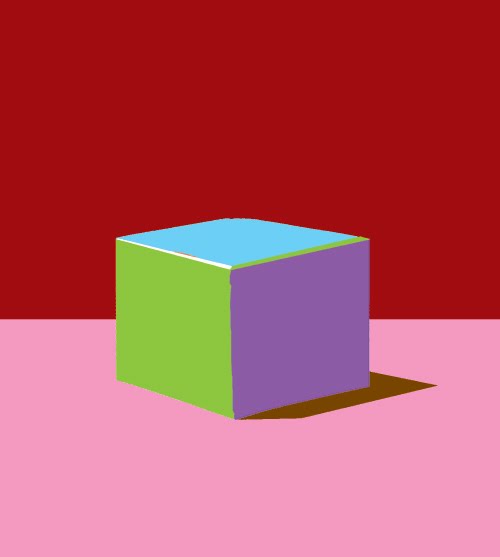
A Color Theory Exercise: Colored Cubes in Warm and Cool Light

This is a challenging exercise I'd recommend for any professional artist and/or student with Photoshop savvy to create their own version. I'll post the basic cube so you can do it yourself. It's like a Rubik's cube for artists!
Also, if you're a more experienced professional than I, please comment below and tell me how I could improve my color relationships with a short critique.
-Are the relative values correct?
-Is the background color hindering or strengthening the effect?
-Do the warm and cool versions of each cube seem like they are identical aside from the relative warmth of their lighting?
Here's the scrambled cube if you'd like to test or improve your skills:
-------------------------------------
View my portfolio at: www.spencerhallam.com
No comments:
Post a Comment