Wednesday, September 29, 2010

Sketch Night at the Society of Illustrators NYC


This Tuesday I attended a figure drawing session at the Society of Illustrators in New York.  The inexpensive class has 2 live models, live music, and a full bar decorated by a large Norman Rockwell painting.  It's a pretty amazing venue, especially for a drawing class.

Here are some of the sketches of 5 to 20 minute poses using a ink brush/marker.  I really enjoyed the dry brush effect when it worked in my favor.  I posted the image below so you can see the texture close up.


---------------------------------------------

View my portfolio at: www.spencerhallam.com

How to Create Color Harmony


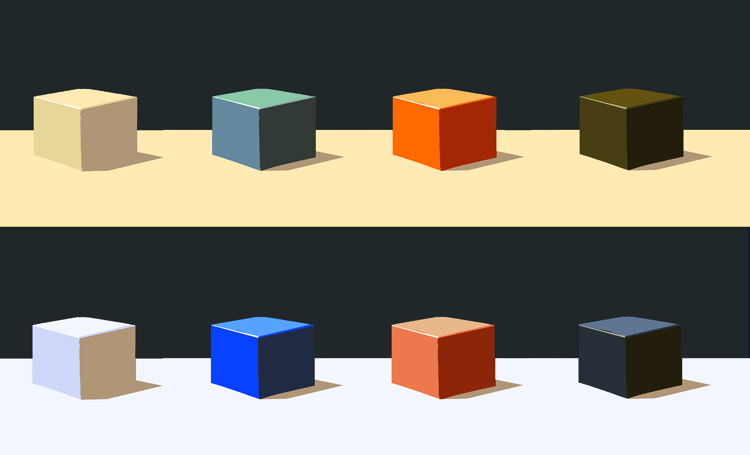
This is a follow up post to color game I posted earlier.  I wanted to show how to see and create the illusion of different colored light.  This illusion is particularly notable when looking at objects whose local color is the compliment, or opposite hue, of the light source. I've also given both images the same neutral background color to make comparisons more easy.

As with the previous post  the top 4 cubes are in warm (orange) light, while the bottom 4 cubes are in cool (bluish) light.  Both rows are depicting cubes of the same color (white, blue, orange, and black).

Notice that the color saturation (also called intensity or chroma) of the blue cube is more intense when the light source is of the same hue while the blue looks more neutralized and gray under a complimentary light source.  You can see the same phenomena occur by comparing the orange cube on the top with the orange cube on the bottom.

* an advanced note, I originally created this post  for my own purposes so I ended up using paint mixing compliments for the steps of hue.  In the future I'll recreate this demonstration from the more accurate visual primaries (RGB+CMY) as well.
---------------------------------------------

View my portfolio at: www.spencerhallam.com

Friday, September 17, 2010

An Artist's Challenge: A Color Theory Exercise

A Color Theory Exercise: Colored Cubes in Warm and Cool Light


Above is a demonstration of the effects of warm and cool light on cubes of primary and secondary colors.  I created this a few months ago after some intensive color theory study of my own.  I created one cube in Photoshop then copied and pasted it rows of 8 across.  I selected the proper color for each plane of the cube to depict the accurate color in either warm or cool light and filled each side.  The idea was to put any reference aside and try to predict how the colors would behave.  After more study and advice I intend to adjust the colors as I begin to see mistakes.

This is a challenging exercise I'd recommend for any professional artist and/or student with Photoshop savvy to create their own version.  I'll post the basic cube so you can do it yourself. It's like a Rubik's cube for artists!

Also, if you're a more experienced professional than I, please comment below and tell me how I could improve my color relationships with a short critique.

-Are the relative values correct?
-Is the background color hindering or strengthening the effect?
-Do the warm and cool versions of each cube seem like they are identical aside from the relative warmth of their lighting?

Here's the scrambled cube if you'd like to test or improve your skills:

Good luck!

-------------------------------------
View my portfolio at: www.spencerhallam.com

Friday, September 10, 2010

An 8"x10" oil study in 45 minutes

This is a quick study was done from some photo reference.  If I remember this one was completed in about 45 minutes some studies are finished in half that time. Paintings done this way can end up with a "flying by the seat of your pants" unfinished aesthetic.  This one fortunately turned out to be a surprisingly nice little painting.


-------------------------------------
View my portfolio at: www.spencerhallam.com