Saturday, April 16, 2011

Keith Richards


As a departure, I've been doing some studies using famous musicians.  A caricature of Keith Richards from The Rolling Stones almost draws itself. What a face! This could be a good way to start learning to draw leather or craggy rock formations.

Just kidding.

------------------------------
View more of my artwork at: www.spencerhallam.com

Sunday, April 3, 2011

Car Thumbnails

Car thumbnails from my imagination...

So far, it's seemed easiest for me to draw the wheels in more or less accurate perspective first in order to "ground" the car. Afterward I conceive of the larger shapes as simply as possible, then begin to fill in the details.

Since I don't draw cars very often I'm a little naive about the details and conventional proportions of conventional automobiles. So these ideas look a little outlandish after my slap dash guess work. This is all okay since repetition and creativity counts at this stage while I get a "feel" for it.   


Cars from photo reference:

This makes a big difference. Since these cars already have their details in the right spot I only have to render them more or less faithfully.  Each of these cars took about the same amount of time to draw as the thumbnails above, but are now much more rooted in observations in reality.


I often flip between drawing from observation and drawing from my imagination.  Both methods influence each other in a positive way.

Media: pilot pen toned digitally.

------------------------------
View more of my artwork at: www.spencerhallam.com

More on Rendering Chrome

Chrome is a three dimensional mirror-like reflective surface. Chrome adopts its color entirely from its surroundings.  To render chrome from imagination you must choose the environment surrounding the object being constructed.

Blue sky and asphalt reflect clearly on the surface of chrome.

Since we usually see chrome on cars and since cars are usually outdoors and on the street, we commonly see the asphalt on the ground plane and blue sky above reflected onto the surface of the metal and reflected sharply back to our eyes.  A different environment would create a different colors.  For example, our car was parked in a grassy park during sunset (see below).

left to right: sunset w/grass, snow w/blue sky, and sunny day at the beach


The brightest light reflects of upward facing surfaces from the sky. The sun, if visible, creates a bright white highlight. On downward facing surfaces we see the ground reflected.  Distant objects reflect dramatically less light than the sky and appear almost black; the ground closest to the tire reflects light of brighter value, but still much darker than the sky.

Real world reflections are almost always more complicated than this since since any nearby object could be visible on a surface.  When rendering from photo reference or from real life, this knowledge can help you understand and even simplify your observations.

Now that we've talked about chrome, we can begin to talk about how reflective, colored surfaces react to their environment.

Try it out!

------------------------------
View more of my artwork at: www.spencerhallam.com

Tuesday, March 15, 2011

Reflective Surfaces: Chrome and Automobile Paint Jobs


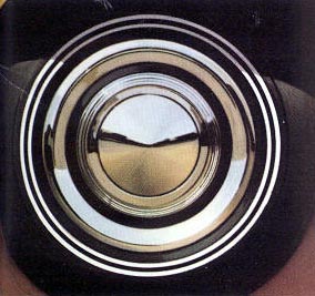
To render chrome effectively you must first choose an environment to be reflected onto the surface of the chrome.  In the photo above you can clearly see the earthy color of the road below and the paler blue sky above.  Downward facing surfaces will reflect the ground and upward facing surfaces will reflect the sky.  Look closely at each ring on the hub cap and guess the angle by what is being reflected.

A reflective colored surface will do the same, but the effect is dramatically influenced by the local color beneath the reflection. A darker color will reflect its environment more clearly than a lighter finish, especially white.


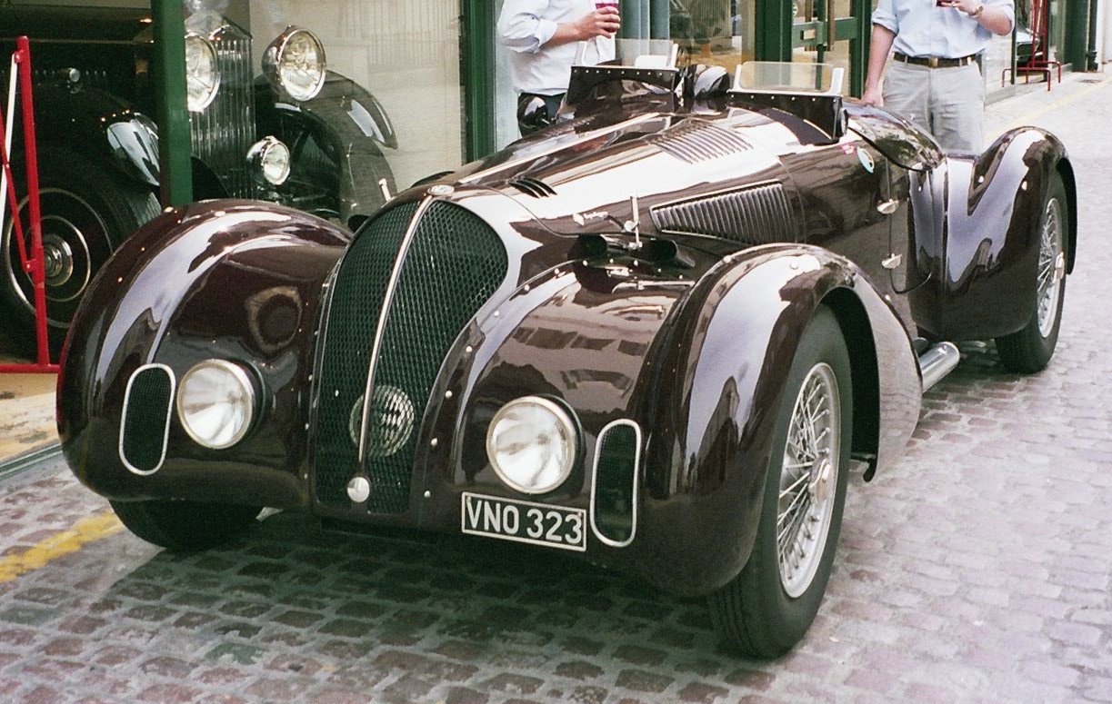
All the lighter shapes on the surface of the above vintage automobiles are reflected images of the sky above.  The local color is shifted toward a blue hue (making it more  red-violet or violet) and lightened (desaturated with white) where the reflection is visible. These details are hard to invent, but we can begin to make some generalizations.

 ------------------------------
View more of my artwork at: www.spencerhallam.com

THE RAT RACE: Drawing and Painting Cars from Imagination

I was never much of a car and truck lover as a child so I tend to naturally shy away from drawing mechanical things. More recently I'm trying to be better at this, because it's a pretty big deficit if you don't have the ability as an illustrator. Luckily, many of the principles are the same as with painting a still life, portrait, or landscape.  However, it does require a more slavish adherence to the rules of perspective.


Below are some steps I took in my process.  Notice that I started with a horizon-line, rough 2pt perspective lines, and a gray background.  Also, I worked out my value structure before I started adding color.  Once these foundations are in place, the details are easy to place relative to the larger perspective and value structures.


 Ultimately this was a successful piece for me.  The biggest was to render the reflective surface of the car.  In the end I arrived at a matte finished surface with some reflective elements added in to suggest the environment reflected onto the surface of the car.  Reflections, are so variable, but I can find some tricks to inventing them.  I'll post some new renderings as I do.

Below you can see the warmer color, higher value contrast, and greater level of detail used on the foreground edge of the car as opposed to the cooler, duller, soft-edged, low contrast relationships used rendered the back end. Since this transition occurs slowly over the surface and stays in the red hue family (red-orange to red-violet) our eye/brain perceives it as the same local color under varied lighting conditions.


------------------------------
View more of my artwork at: www.spencerhallam.com

Monday, March 14, 2011

The Effect of LIght on Local Color

I made the two diagrams below to help anyone trying to understand how color changes under different lighting conditions. I've started with a local color at top (sort of a dull red) and shifted the color to show it's possible variations under different color and intensity of light. Here are some vocabulary words to start.

Four "Dimensions" of color:
 
Hue:  Generally this just means the "color." Blue, Red, Yellow-Green, and Magenta are all hues. White, gray, and black are not hues. 

Value: The relative lightness or darkness of a color.

Chroma: Sometimes called color intensity, saturation, or brightness.  This is the relative dullness or vividness of a color.   Colors with low chroma are closer to gray while color with high chroma are colors in their unmixed brightest state.

Temperature: Colors are often referred to as warm or cool. This is a relative term and usually used to describe colors in comparison to each other.  Orange is the warmest hue while blue is the coolest.  Yellow and red are somewhere in between. White, neutral gray, and black are also considered cool while browns and warm grays are considered warm. If this is a little confusing it's because this concept is a little less measurable than the three above however it's often useful when comparing colors.

Gray swatches on the far left is there as a colorless value reference. The strip on the far right is a gray local color under warm light conditions.
~ --- ~


When employed this understanding of how light effects local color gives convincing results. The three strips on the right depict the same local color under cool, white-balanced, and warm lighting conditions.  The descriptions at right describe how the reddish local color shifts dimensions in each zone.

Also see my post about how lighting conditions effect a range of different colors.

Hope this helps!
------------------------------
View more of my artwork at: www.spencerhallam.com

Friday, March 4, 2011

Simpifying Values and Value-Key

I created this post to discuss how an artist can think technically about achieving an intended value key discussed in the previous post.  This method helps to simplify an overwhelming number of values into a more workable structure at early stages of a painting (a digital one in this case). The loose renderings below are quick head studies from my imagination as they might be lit for dramatic and compositional purposes.


I began with this basic head drawing which indicates some of the major planes and proportions. This step provides some structure on which to guide my value decisions.


Here I've used only four values to establish the primary value structure of the entire image.  For this exercise I ignored any differences in edge quality between shapes. In this low-key image values 5,7, and 9 dominate while value 2 acts as a contrasting accent on the light side.

~ - ~


For this high-key image I used the same drawing and angle of light as a foundation, however, I've used values 1, 2, and 3 as the dominant values and value 6 as an accent in the spots that even in bright sunlight would remain relatively dark. Note that value 6, though used as a "dark" accent, is still in the middle of the scale.  A darker value would appear EXTREMELY dark against such a light composition and appear much less realistic and thus more 2D or "graphic".

Thinking about value in this way also gives the artist clearer choices about where to simplify or otherwise edit out extraneous detail. In the darker study, the variety, detail, and focus happens in the light and the reverse is true for a lighter work.

------------------------------
View more of my artwork at: www.spencerhallam.com