In order to create drama and a strong value structure for a painting, artists often choose to work in either a high or low "key" in which to compose their work. Thinking about a painting or drawing in this way helps to simplify value choices, emphasize areas of focus, and create a pleasing interaction of shapes when the painting is considered abstractly.
In a high-key painting, the majority of values are in the lighter than middle gray. Then, dark accents are used to lead the eye around the important areas of the painting. High-key paintings feel light and airy.
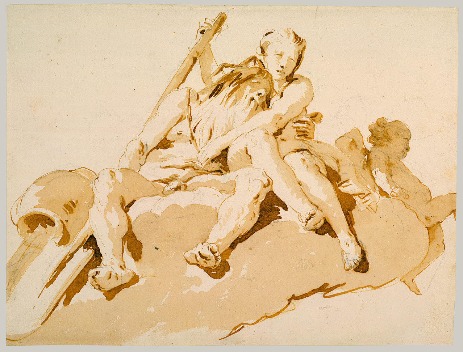
The Tiepolo watercolor above is a great example of a high-key composition. This style tends to mimic daylight by brightening the shadow side of the form and only darkening the areas that even strong ambient light has difficulty penetrating.
In a low-key painting, the majority of values are darker then middle gray. Light values are saved as accents to highlight the important elements in the painting. Low-key paintings feel mysterious and contemplative.
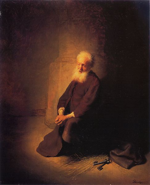
In this Rembrandt painting the elderly man's white hair face and hands command our attention since they stand out so dramatically from the darkened background. It appears that the man is lit by a torch or from a distant window opened up to reveal the sun low in the sky. The painting is composed almost like a yin-yang. The black keys stand out against the lit ground at bottom right adding a secondary focus to the work. Also notice that the shadow is simplified by jointing the dark side of the man's shirt with the cast shadow extending into the background.
Interestingly, the color scheme for both works is essentially identical. They are both rendered monochromatically in a gradient of burnt sienna or brown. The choice of key brings a distinctly different "feel" to each painting.
View more of my artwork at: www.spencerhallam.com
2 comments:
thanks man :)
It seems from my internet searches that high key pencil drawings ate better to look at (and they use less graphite), but my prof insists on low key...
Post a Comment