Tuesday, March 15, 2011

Reflective Surfaces: Chrome and Automobile Paint Jobs


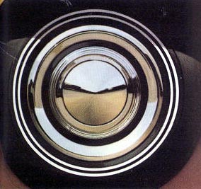
To render chrome effectively you must first choose an environment to be reflected onto the surface of the chrome.  In the photo above you can clearly see the earthy color of the road below and the paler blue sky above.  Downward facing surfaces will reflect the ground and upward facing surfaces will reflect the sky.  Look closely at each ring on the hub cap and guess the angle by what is being reflected.

A reflective colored surface will do the same, but the effect is dramatically influenced by the local color beneath the reflection. A darker color will reflect its environment more clearly than a lighter finish, especially white.
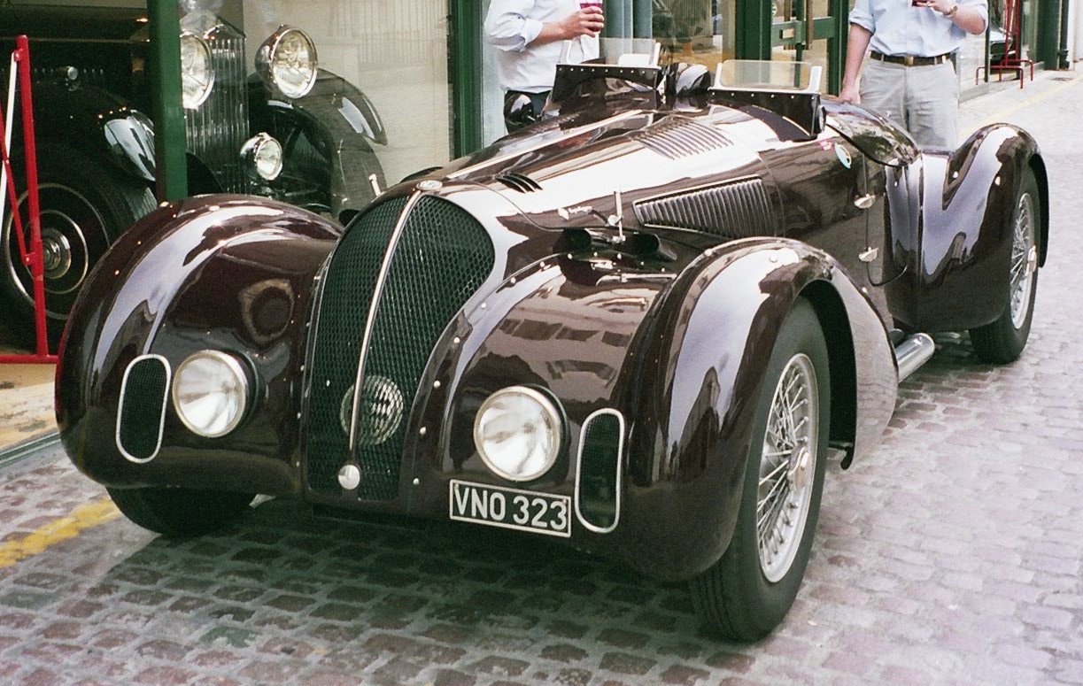

All the lighter shapes on the surface of the above vintage automobiles are reflected images of the sky above.  The local color is shifted toward a blue hue (making it more  red-violet or violet) and lightened (desaturated with white) where the reflection is visible. These details are hard to invent, but we can begin to make some generalizations.

 ------------------------------
View more of my artwork at: www.spencerhallam.com

THE RAT RACE: Drawing and Painting Cars from Imagination

I was never much of a car and truck lover as a child so I tend to naturally shy away from drawing mechanical things. More recently I'm trying to be better at this, because it's a pretty big deficit if you don't have the ability as an illustrator. Luckily, many of the principles are the same as with painting a still life, portrait, or landscape.  However, it does require a more slavish adherence to the rules of perspective.


Below are some steps I took in my process.  Notice that I started with a horizon-line, rough 2pt perspective lines, and a gray background.  Also, I worked out my value structure before I started adding color.  Once these foundations are in place, the details are easy to place relative to the larger perspective and value structures.


 Ultimately this was a successful piece for me.  The biggest was to render the reflective surface of the car.  In the end I arrived at a matte finished surface with some reflective elements added in to suggest the environment reflected onto the surface of the car.  Reflections, are so variable, but I can find some tricks to inventing them.  I'll post some new renderings as I do.

Below you can see the warmer color, higher value contrast, and greater level of detail used on the foreground edge of the car as opposed to the cooler, duller, soft-edged, low contrast relationships used rendered the back end. Since this transition occurs slowly over the surface and stays in the red hue family (red-orange to red-violet) our eye/brain perceives it as the same local color under varied lighting conditions.


------------------------------
View more of my artwork at: www.spencerhallam.com

Monday, March 14, 2011

The Effect of LIght on Local Color

I made the two diagrams below to help anyone trying to understand how color changes under different lighting conditions. I've started with a local color at top (sort of a dull red) and shifted the color to show it's possible variations under different color and intensity of light. Here are some vocabulary words to start.

Four "Dimensions" of color:
 
Hue:  Generally this just means the "color." Blue, Red, Yellow-Green, and Magenta are all hues. White, gray, and black are not hues. 

Value: The relative lightness or darkness of a color.

Chroma: Sometimes called color intensity, saturation, or brightness.  This is the relative dullness or vividness of a color.   Colors with low chroma are closer to gray while color with high chroma are colors in their unmixed brightest state.

Temperature: Colors are often referred to as warm or cool. This is a relative term and usually used to describe colors in comparison to each other.  Orange is the warmest hue while blue is the coolest.  Yellow and red are somewhere in between. White, neutral gray, and black are also considered cool while browns and warm grays are considered warm. If this is a little confusing it's because this concept is a little less measurable than the three above however it's often useful when comparing colors.

Gray swatches on the far left is there as a colorless value reference. The strip on the far right is a gray local color under warm light conditions.
~ --- ~


When employed this understanding of how light effects local color gives convincing results. The three strips on the right depict the same local color under cool, white-balanced, and warm lighting conditions.  The descriptions at right describe how the reddish local color shifts dimensions in each zone.

Also see my post about how lighting conditions effect a range of different colors.

Hope this helps!
------------------------------
View more of my artwork at: www.spencerhallam.com

Friday, March 4, 2011

Simpifying Values and Value-Key

I created this post to discuss how an artist can think technically about achieving an intended value key discussed in the previous post.  This method helps to simplify an overwhelming number of values into a more workable structure at early stages of a painting (a digital one in this case). The loose renderings below are quick head studies from my imagination as they might be lit for dramatic and compositional purposes.


I began with this basic head drawing which indicates some of the major planes and proportions. This step provides some structure on which to guide my value decisions.


Here I've used only four values to establish the primary value structure of the entire image.  For this exercise I ignored any differences in edge quality between shapes. In this low-key image values 5,7, and 9 dominate while value 2 acts as a contrasting accent on the light side.

~ - ~


For this high-key image I used the same drawing and angle of light as a foundation, however, I've used values 1, 2, and 3 as the dominant values and value 6 as an accent in the spots that even in bright sunlight would remain relatively dark. Note that value 6, though used as a "dark" accent, is still in the middle of the scale.  A darker value would appear EXTREMELY dark against such a light composition and appear much less realistic and thus more 2D or "graphic".

Thinking about value in this way also gives the artist clearer choices about where to simplify or otherwise edit out extraneous detail. In the darker study, the variety, detail, and focus happens in the light and the reverse is true for a lighter work.

------------------------------
View more of my artwork at: www.spencerhallam.com

Monday, February 28, 2011

Low-Key vs. High-Key Paintings

In order to create drama and a strong value structure for a painting, artists often choose to work in either a high or low "key" in which to compose their work.  Thinking about a painting or drawing in this way helps to simplify value choices, emphasize areas of focus, and create a pleasing interaction of shapes when the painting is considered abstractly.

In a high-key painting, the majority of values are in the lighter than middle gray.  Then, dark accents are used to lead the eye around the important areas of the painting. High-key paintings feel light and airy.


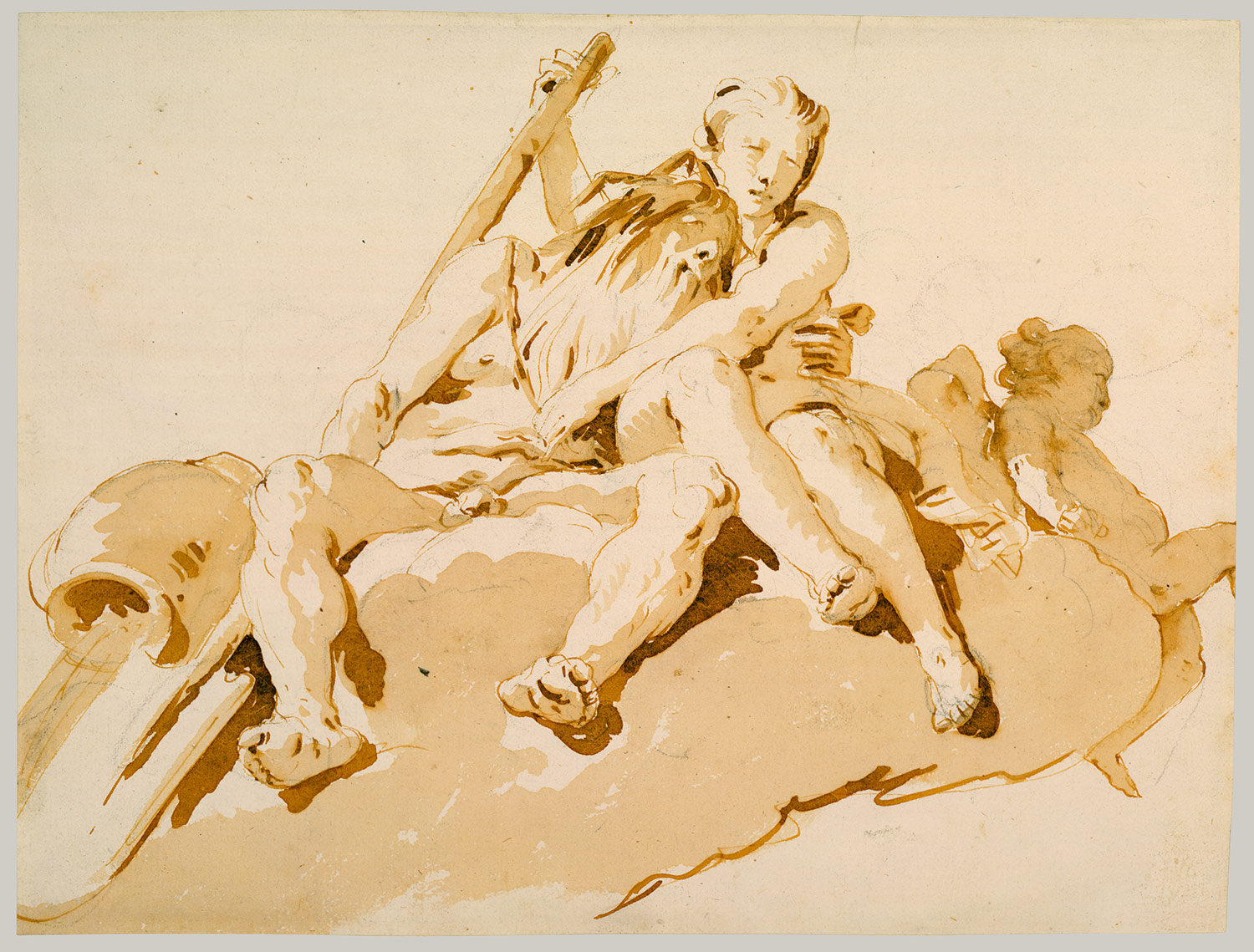
The Tiepolo watercolor above is a great example of a high-key composition.  This style tends to mimic daylight by brightening the shadow side of the form and only darkening the areas that even strong ambient light has difficulty penetrating. 

In a low-key painting, the majority of values are darker then middle gray.  Light values are saved as accents to highlight the important elements in the painting. Low-key paintings feel mysterious and contemplative.


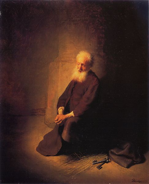
In this Rembrandt painting the elderly man's white hair face and hands command our attention since they stand out so dramatically from the darkened background.  It appears that the man is lit by a torch or from a distant window opened up to reveal the sun low in the sky.  The painting is composed almost like a yin-yang.  The black keys stand out against the lit ground at bottom right adding a secondary focus to the work.  Also notice that the shadow is simplified by jointing the dark side of the man's shirt with the cast shadow extending into the background. 

Interestingly, the color scheme for both works is essentially identical.  They are both rendered monochromatically in a gradient of burnt sienna or brown. The choice of key brings a distinctly different "feel" to each painting.

------------------------------
View more of my artwork at: www.spencerhallam.com

Sunday, February 27, 2011

Atmopheric Perspective

On a sunny clear day in Manhattan you can see the effects that the air has on the value contrasts of the distant buildings.
~ - ~


Through rain and fog this effect is made more apparent and the graying effect happens at a shorter distances. Droplets in the air cause light from the objects to refract and lose any distinct edge. Notice that foreground shadows are dark creating a balance of light and dark throughout the image.


As we zoom in you can see the objects become gray and diffuse.

At this depth the values hardly get darker than a 50% gray.


------------------------------
View more of my artwork at: www.spencerhallam.com

Chiaroscuro from Observation

 I took a walk today in Fort Greene Park in Brooklyn.  I couldn't help taking a photo of this decorative cement sphere that guards the top of the steps. It shows nearly textbook chiaroscuro. Also, if you look close enough you can find the Empire State Building in the background.


 On the brightness of the reflected son has overloaded my wimpy cellphone camera and therefore bleached out the light side of the value range (my eyes could). A core shadow is hardly visible because the dark side is illuminated by the ambient light from the clear blue sky. Also, there is no visible highlight since the surface isn't smooth enough to reflect an image of the light source.


You can see that the texture of the surface is most apparent between the lightest lights at left and the shadow at right. This is so for 2 reasons: First, at nearly tangent angles of light, the surface bumps are casting their own tiny shadows.  Secondly, the mid-tone gives us the most detailed look at the surface since less light would limit the amount of light reaching our eyes and extreme daylight can bleach the light side.


At bottom right you can see a little bit of reflected light bouncing into the underside of the ball. Also, since there is so much ambient light, which lightens up the cast shadow, you can see that the occlusion shadow on the ball becomes emphasized. It looks like a black line around the edge of the ball.

Visit my Chiaroscuro Lesson to find out more details about drawing spheres.


------------------------------
View more of my artwork at: www.spencerhallam.com