 |
| What's this thing? Read on to find out! |
It can be difficult to improve at realistic color when good (but incomplete) rules of thumb are repeated over and over like mantras as though hearing them again will make one understand something new. Since I find this troublesome I wanted to talk about a couple of rules I hear over and over and attempt to provide a deeper description that might help get a painter past some of the more cliched rules that teachers and introductory books often dwell on.
Here goes . . .
GOOD RULE: The light side and the dark side of an object have opposing color temperatures:
I often hear the common rule of thumb when rendering form in color essentially it states that warm light will cast cool shadows and that cool light will cast warm shadows (see earlier cube study). This generally seems like a good rule, but I have always felt that this rule often becomes confusing when considering the appropriate chroma (or saturation) of a chosen color plane.
CRITICISM: Much confusion can occur when local color transitions toward the shadow side of a form and thereby loses saturation. Since more neutralized shadow color is usually going to be more cool than the local color, then the relative saturation can confuse the above rule about color temperature.
How about this blue cup placed in the cool light of a window? Are the shadows here clearly warmer?
 |
| Is this shadow warm? |
Another downside to this rule is that it causes a novice painter to immediately mix in orange into the lights and blue into the shadows. Though, this is a start, it will often result in very exaggerated, acidic color.
Lastly, light can be balanced and therefore neither warm nor cool. Bright cloudy days can be like this. How do we deal with relative temperature then?
GOOD RULE: Color is more intense on the light side of an object
Many times this is repeated as "color obtains the light" (which sounds like it was first said by some one in a big floppy beret and moo moo-like painting smock). If that were absolutely true then the more light on an object then the more color saturated it would be. Maybe this is true in physics but the receptors in our eyes have limits and bleaching of the light occurs.
CRITICISM: Most painters discover this problem when they mix their light side colors. If the light source is warm then as the object becomes lighter it should increasingly adopt the warmth of the light. However, when mixing paint an artist runs out of bright (saturated) colors that are also light in value and must mix in white to lighten, which ends up cooling off (by neutralizing) the highlights.
So how can we conceptualize the gradating colors on an object from it's shadow side through the mid-tone and ending on the highlight? Does color really "obtain" the light? Do warm lights cast cool shadows and vice-versa? These are good basic rules, but I've been thinking of another one to help out. This rule should tell us which part of an object gets the most saturated version of the local color?
Here's what I've come up with:
SUGGESTED RULE: Chroma is highest between the effects of bleaching and shadow.
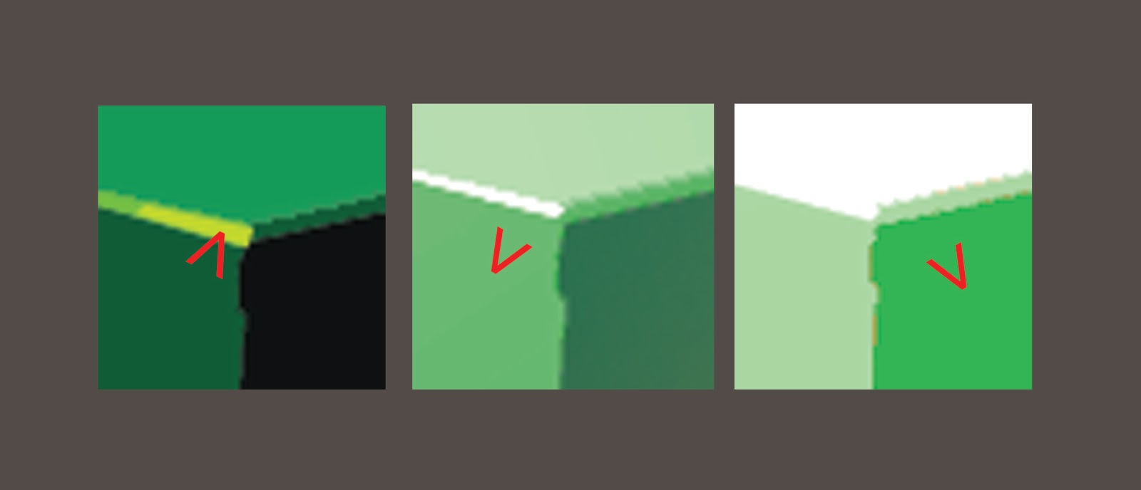
Local color achieves it's highest chroma when sandwiched between areas of intense bleaching intense light, and the beginning of the shadow side when there is little reflected light. This rule seems to hold true in a variety of circumstances. See the cubes I've made below to see what I mean.
 |
| Which plane of each cube above has the greatest chroma? |
- The highlight has greatest saturation in low light/low key environments (like candlelight) since there is no bleaching effect
- The mid-tone is the most saturated at medium light levels when the local colors the light side begins to bleach yet there's not so much light as to reflect very much of it back into the shadows (like in a well lit room or on an overcast day.
- The shadow side however becomes the most saturated when the light source is so bright that even the mid-tone begins to bleach and enough light begins to reflect back into the shadow side to fully illuminate it (like on a bright cloudless summer day).
 |
| The planes on the cubes with the highest chroma are indicated. |
What do you think? Can this be true? I can't be the first one to have looked at this as a rule.
Please leave a comment and let me know if you'd like to add to this topic or can link to a similar discussion of this topic elsewhere on the internet.
------------------------------------
view my portfolio:
www.spencerhallam.com


